Exposed: The Secrets We Used To Earn $125.00 Per Visitor
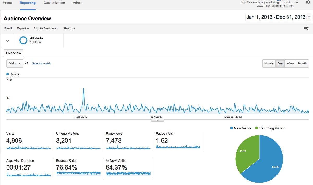
UglyMugMarketing.com generated almost $400,000.00 in revenue in 2013. Not too bad when you consider only 3,201 people visited the website. That’s an average of over $125.00 per visitor to the site.
Of course not all of our revenue came through our website, but a very large percentage of it did. And I’m certainly not claiming if you read this article that your website will magically start making more money (or any money). The point of this article is to show you the specific steps we took to get our website to convert visitors into dollars.
Here is what is really cool. We don’t even sell anything directly on our website. Meaning there aren’t any BUY NOW or ADD TO CART buttons anywhere on our website.
But don’t let that fool you!
Just because we don’t sell anything on our website doesn’t mean our website isn’t a powerful sales tool. It is!
Stick with me for a few minutes and I’m going to show you exactly how we use UglyMugMarketing.com to:
- screen prospects
- nurture leads
- convert them into customers, and
- ultimately transform them into evangelists.
UglyMugMarketing.com didn’t initially generate $125.00 per visitor.
You see, we are currently on the fourth version of UglyMugMarketing.com. The first was ugly (literally) and didn’t convert at all. Actually, I think it may have scared people away.
Our next site was definitely “prettier.” It was the type of site that you would expect of a professional website design company…but it didn’t convert.
It wasn’t until we launched the third version that our website that it actually started converting. We left the third version of the site up for about a year, and during that year we continually tweaked and tested to improve conversion rates.
Version 3 of the website helped us generate almost $400,000 in revenue in 2013.
We’re now on to version 4.0, and from the initial data, it looks like this version will out perform all three previous versions combined.
Here’s How It Works
Let’s take a minute to dive into what makes this website work so well.
Above the Fold
Above the fold, above the fold, above the fold…if you’ve been around the interwebs for any length of time then you’ve heard people talk about the importance of what is above the fold. (Above the Fold = the section of a website that is displayed on a screen without having to scroll.) Whatever is above the fold is the most valuable real estate on your website.
Here’s what is above the fold on our site:
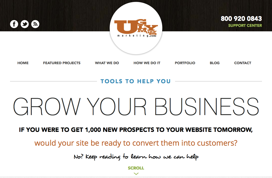
Let’s dive into what makes our site convert.
The first thing I want to point out is our primary headline: Tools to help you GROW YOUR BUSINESS. By utilizing this headline, we are actually going against conventional wisdom for a web design company. Take a minute to explore websites of web design companies and you will discover that most of them keep the focus on their ability to design beautiful websites.
The truth is we don’t care about beautiful design. Our primary concern is making sure the website is designed to help grow our clients’ businesses. Our primary headline indicates that we provide tools to help you. Help you do what? Grow Your Business!
Ultimately, that is why people want a new website. They want the website to help grow their business. Non-profits are no different. They want a new website to help them attract more donors, raise more awareness, and help effect change.
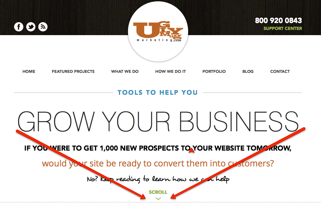
The next core part of our copy is designed to intentionally throw people off balance (I’ll spare you from hearing the NLP explanation of this concept) to make them slightly uncomfortable.
If you were to get 1,000 new prospects to your website tomorrow, would your site be ready to convert them into customers?
No? Keep reading to learn how we can help…
Regardless how good your website is, asking this question causes you to wonder if there may be things you could or should do differently to help turn more of your visitors into customers.
The vast majority of visitors who read this sub-headline are going to answer “no”. Next, we give specific instructions to people who answered no. Keep reading to learn how we can help.
In this all important, above the fold section, we utilize a subtle design element with the text to naturally draw the eye down the page.
At UglyMugMarketing.com we really don’t care about beautiful design.
Okay, I lied.
At Ugly Mug Marketing design is secondary to us. What matters most is building websites that help grow businesses. However, our clients are very demanding. Only kidding! But in addition to a website that helps them significantly grow their business, they also want it to look awesome.
Notice how the very next section on our website contains a sampling of a few websites we have built. If you look carefully at this section, you will discover that we have carefully selected a broad range of design styles, from modern to traditional. This accomplishes two things:
- Allows us to showcase the diversity of our design talent.
- Appeals to a broad range of our visitors’ style preferences.

The other thing to notice here is that directly below these few website samples, we have a big headline that highlights a common question that visitors looking for a new website ask, “What makes this company different from all the others?”
There are thousands of website designers to choose from, so what makes us any different? We intentionally ask this question before our visitors really even have a chance to think about it.
The visitors who want to see what makes us different can click READ MORE ABOUT US. This button directs them to a new page which highlights five core philosophies that separate us from all our competitors.
Side note: What makes your organization different? Why should a customer choose you over all of the other options available? If you don’t know the answer to this question, how can you realistically expect your customers to choose you?

In the next section we clearly show our three core areas of service: Website Design, Graphic Design, and Business Growth. Using three large icons forces people to at least take some notice of what we offer. When moused over, each of these icons display a short section of copy that is designed to accomplish two things:
- Highlight the core problem that our visitor is facing.
- Position us as the place to solve their unique problems and challenges.

The Our Featured Projects section is designed to again reinforce the fact that we can design a beautiful website, regardless of the industry. We hand select six projects to feature in this section, and occasionally change them out with more recent projects.
THE MAGIC OF GOOD COPY, SOCIAL PROOF, AND RECIPROCITY

Although it is a small section, a lot of very important marketing is taking place in this area. This section not only reinforces our authority in the marketplace, but then validates it through the use of social proof (testimonials). Through the opt-in on the right we position ourselves as a company that cares about helping our visitors succeed, regardless whether they decide to work with us. Here are the highlights from this section:
- We remind the visitor that our passion is not only great design, but websites that convert.
- We then take it a step further and explain why tools that convert matter…because they put money in our clients’ pockets.
- To back up what we are saying we offer visitors the ability to see what our previous clients have said about our working relationship.
- On the right hand side of the page, we offer visitors free tools to help them get more from their website. After opting in, we provide them with several powerful tools and strategies they can immediately begin using to improve their current website.
A LITTLE DEEPER – A LITTLE MORE TRUST

If a visitor is still scrolling down the page by this point, they either have nothing better to do with their time, OR they are interested in learning more about who we are and how we can help them.
In this section we provide a little more detail about each of the specific areas of service we provide. In each of the four tabs, we utilize a little of the Socratic Method to present critical questions to our visitors. The goal here is to highlight the fact they we offer solutions that will get results.
EXPECT MORE? LET’S TALK.
After highlighting their problem(s), and our solution(s), now is the perfect time to see if they want to continue the dialog outside of the website.

Through the use of copy, we’re implying that our visitor should expect more from their website. And naturally, if they do expect more, the next obvious step is to contact us.
THERE IS A FORMULA FOR SUCCESS (ONLINE) – AND WE KNOW IT
To further enforce our position as experts, we show visitors how we build sites that are both beautiful and convert well.

Although the Critical Five is a simple formula, once people learn about it, they don’t want to have to do “all that work” for themselves. Can you see why showing this formula works to our advantage?
THE LATEST TREND
Responsive design is the latest buzzword around the web. As more and more users are accessing the web from mobile devices, it is important that websites display quickly and correctly on these devices. We use this section to show off our ability to design and code with responsive design.

The language, Responsive Design, is very important. This is a term that many visitors to our site have heard of, but the vast majority don’t really understand what is means. Through the use graphics to quickly show people what is Responsive Design, how it works, and why it’s important.
A PICTURE IS WORTH A THOUSAND WORDS – OR SO THEY SAY

In this section we provide visitors with the ability to browse through a wide sampling of our design work. We intentionally place a broad sampling of our projects on this page. We don’t even always keep the most recent projects on this page, because our primary concern is keeping a varied showing of our work in this section of the site.
When viewed on a regular computer, you’ll notice a nice mouseover effect on each of the thumbnails. This is done intentionally to showcase our ability add “cool” features on websites. Even though we don’t really care about these types of special features, we know that our visitors like them and want to incorporate them on their website.
LET’S CONNECT

Many companies make the mistake of not providing visitors with multiple methods of connecting with their business. You want to provide your visitors with as many methods of contact as possible. You can see that we provide four ways for people to contact us: form, mail, phone (toll-free & local), and email.
THE CALL TO ACTION

Every page throughout your website should have some form of call to action. You can see in the closing section we say, “Now you have a decision to make. You can keep looking, or you can contact us and let us help grow your business. The choice is yours!” We know that most of the visitors are only looking and exploring, but here we prod them a little.
How can you prod visitors on your website? How can you get them to take the action you want them to take?
You’ll also notice that we have added some social proof with our AS SEEN ON section. The primary objective here is to validate our credibility by showing where we’ve been featured.
On the right side of the page we give people the ability to find and connect with us via our social media platforms. Although we aren’t as proficient with either our Facebook or Twitter pages, we certainly want people to know that we are there, and they can connect with us via social media.
Okay, enough about our website. Let’s talk for a minute about you and your website. I’m going to ask you to spend the next 60 seconds evaluating your website.
FOUR QUESTIONS YOU MUST ASK
- Are you happy with the way your website is performing right now?
- Is your website helping you capture leads and close sales?
- Is your website helping you and your business reach its goals?
- If you were to get 1,000 new prospects to your website tomorrow, would your site be ready to convert them into customers?
How did your site do? How many of those questions did you have to answer with “no”? All of those questions are important, but question number four is the most indicative of the effectiveness of your website.
Not everyone who visits your website is ready to purchase. So what, specifically, is your website doing to move them closer to making a purchasing decision?
NO MORE EXCUSES!
How long have you been thinking about having a better website built?
How many prospective customers do you miss out on because of your mediocre website?
How many websites of your competitors have you looked at enviously, wishing that your website was a fraction as effective?
It’s frightening to realize that each time a visitor comes and leaves your website, you are missing an opportunity to acquire a new customer.
And instead of taking action and improving our website, we make excuses why we can’t have a website that helps grow our business.
When we surveyed our clients and prospects, 94% of them said they wanted to learn how to convert more website visitors into paying, satisfied customers. And yet, very few of them ever take the actions required.
You already know it is more than just knowing what to do. There are thousands of articles and blog posts that teach exactly how to increase the effectiveness of your website.
Waiting another month, reading another article, or talking with another colleague won’t change anything. If more information alone were enough, you would have already done it.
Sometimes, it takes a little prodding from someone else to get us to take the action we know we need to take and improve our businesses.
Today, your business has more opportunity to reach the world than at any other point in human history. Through this magical thing called the internet, we can connect with prospects and customers from literally every corner of the globe.
Is your website helping you leverage this opportunity? If not, why not take action today to correct this flaw?
- Likes, Shares, & Comments WON'T Put Money In Your Bank Account.
- In Our Free Course: Crush It On Facebook In 30-Days Or Less
- You'll Discover: A Simple Facebook Strategy We Used To Take a Client From Losing $10k Each Month To Making Thousands...In Only 86 Days.
- The 3-Step Formula We Used To Increase Another Client's Sales By Over $9,000 per Month (and they're spending less than $400 per month on Facebook Ads)


2 thoughts on “Exposed: The Secrets We Used To Earn $125.00 Per Visitor”